Digital energy-service portal
Connected in 3 clicks
We built an intuitive web portal for the region's power grid company that lets people of retirement age connect their home to the grid in 3 clicks — with no office visit and no paperwork.
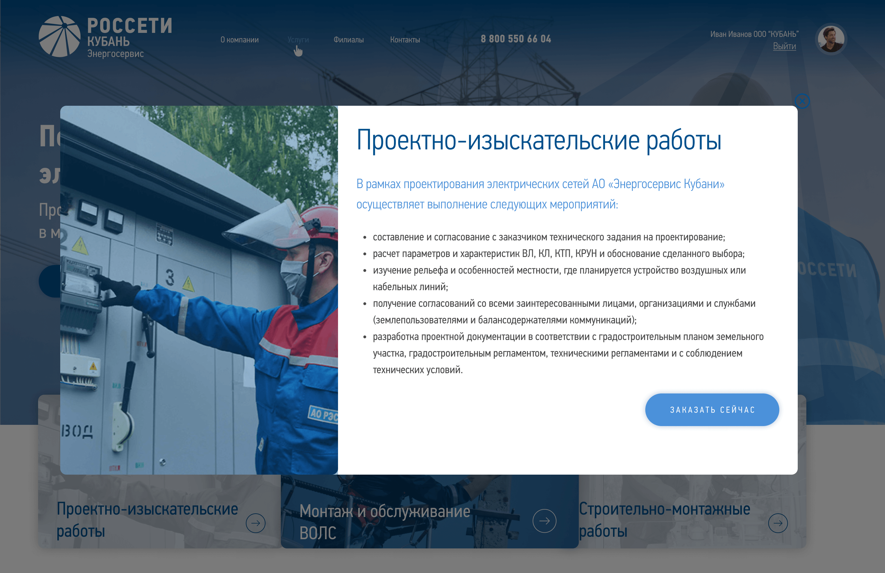
The challenge
Before the portal launched, the process of connecting to the power grid was 'analog'.
- People stood in line at the utility's offices
- They filled out paper applications with many fields
- Older people (the core audience of the private sector) had to come back repeatedly just to check the status
- The company lost customer loyalty due to a long customer journey
The solution
We approached it as a socially significant product, where every UX detail was tested on the target audience.
Simplified applications
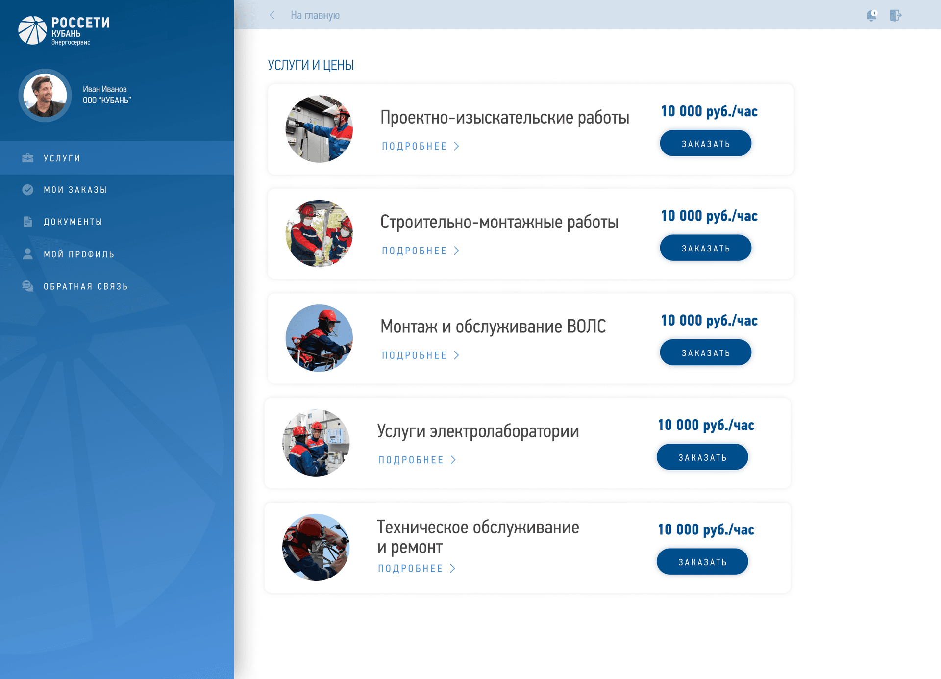
The customer picks a service and fills in a minimal form. No extra steps, no sign-up before applying, no captcha, no complex fields.
- Click 1: pick a service from a visual catalog (large cards, icons)
- Click 2: fill in a minimal form (address, phone, power)
- Click 3: confirm submission
Inclusive UX design
Designed specifically for older users, accounting for how they perceive information.
- Large fonts and high-contrast colors for people with reduced vision
- Plain wording instead of bureaucratic terms ('Connect your home' instead of 'Technological connection of the facility')
- Minimal form fields (address autofill, dropdowns instead of manual input)
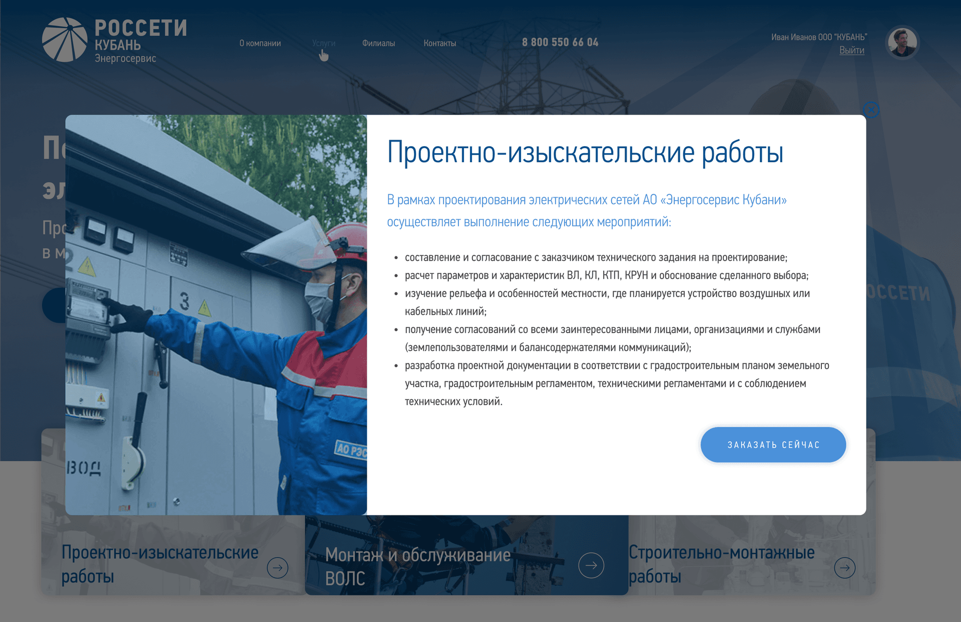
Interactive branch map
The map shows the nearest utility office if the customer wants an in-person consultation — with address, phone and opening hours.
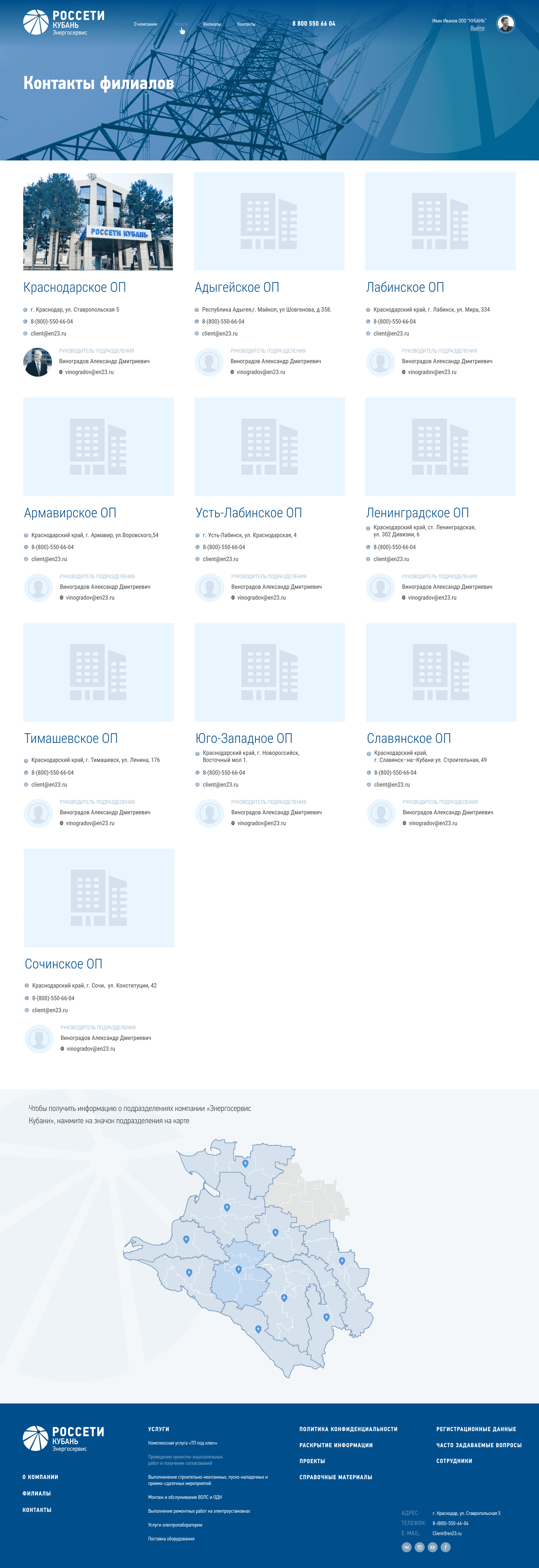
Personal account with tracking
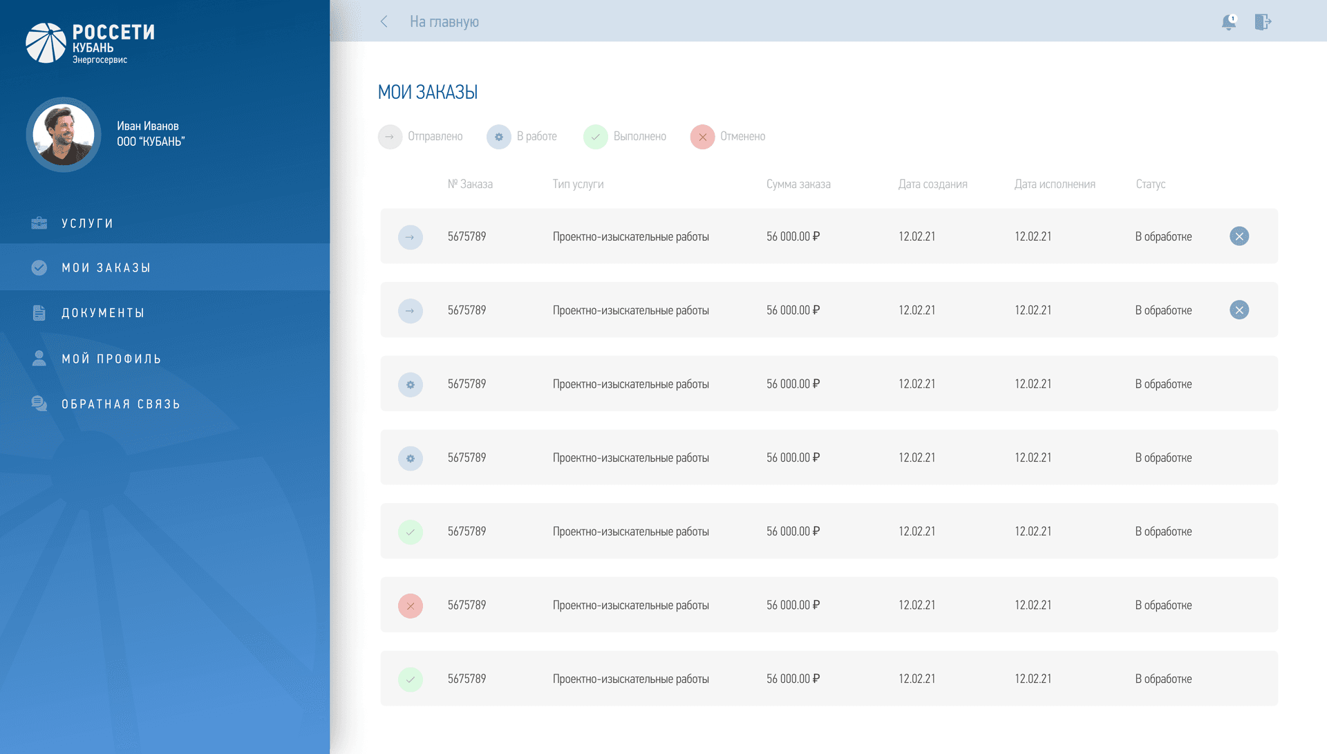
The customer sees the application status in real time: Received → In progress → Done. Email notifications at each step via Yandex SMTP.
- Received — the application is registered in the system
- In progress — a manager is reviewing it
- Done — the service has been delivered
Admin panel
The company's managers process applications through a convenient back office with filters by region, date and status. Bulk operations (sending notifications, Excel export). Management of services, branches and documents.
3 clicks to the goal
Not marketing — an architectural decision
Most government services require
- 1Registration
- 2Email confirmation
- 3Filling out a profile
- 4Choosing a service
- 5Filling out a form
- 6Signing via the national ID system
Our solution
- 1Home → 'Connect your home' button
- 2Form with 4 fields (address, phone, power, comment)
- 3'Submit' → Done!
Technical solutions
Deferred registration
The application is created anonymously; the user registers afterwards if they want to track the status
Address autofill
Address-suggestion API (the customer types only the street, the system fills in region/city)
Email as ID
A single email is enough to stay in touch — no passport data 'at the door'
Smart validation
The form validates fields on the fly (a green check appears instantly, so the customer knows it's right)
Tech stack
Backend (API & Business Logic)
Frontend (User Interface)
DevOps & Deployment
Results
Quantitative
Growth in applications
Customers reached out more often, because 'now you can do it without leaving home'
Lower load on offices
Fewer queues; managers focus on complex cases
Qualitative
Higher customer satisfaction
Positive feedback from the older audience
Finally I can apply myself, without a trip to the office
Improved image of public services
Even Rosseti made a proper website!
Even Rosseti made a proper website!
Social impact
Digital accessibility for older people (the principle of inclusivity)
What we demonstrated as a studio
UX for non-standard audiences
Designing for people aged 55+ requires a different approach than for tech-savvy users
Simplifying complex processes
We took a bureaucratic process and made it human
Full-stack development
From PostgreSQL to responsive markup
Production-ready systems
Not an MVP, but a full product for the whole region
Social Impact Tech
Technology that makes people's lives better
Project gallery
Interface screenshots across devices